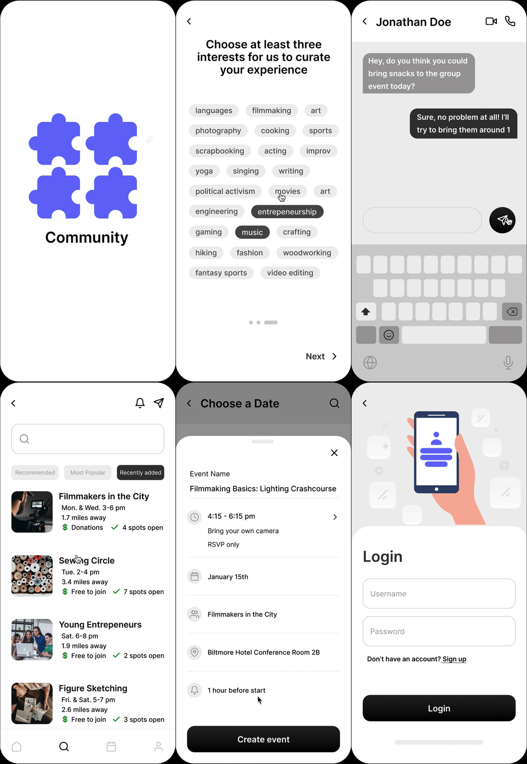


COMMUNITY
A mobile app that helps users find groups of people with similar interests to meet and collaborate with


THE PROBLEM
As we get older, it becomes harder to find groups of like minded people to enjoy hobbies and other passions with
As an adult, it is hard to find and build community. After completing higher education, research shows people have more trouble making friends, sports teams and social clubs are harder to come by, and hobbies tend to die out since work takes up much of our waking hours. Besides coworkers, working adults don’t interact with many new people in their day to day lives, and find it hard to keep up motivation for certain passions all alone. This is where Community comes in.
Community aims to make it easy for people to meet others, connect on their passions, and create lasting friendships and meaningful collaboration for all.
HIGH LEVEL TIMELINE
3 week conceptual case study
USER GOAL
To join and create social groups of like minded people that are active in their passions to talk to and collaborate with
BUSINESS GOAL
To make joining and creating social groups as easy as possible in order to drive app sales and gain and retain subscription payments
MY ROLE
Lead UX Designer and Researcher
I was the sole designer leading this conceptual case study over three weeks, during which I ideated early concepts, ran design sprints, completed 2 rounds of user research, and delivered the final design assets.

UNDERSTANDING THE USER
User research was conducted to understand the current attitudes and habits of potential Community users
From our research, we’ve found that the majority of participants only engage in 1 group activity a week or less, even though most reported feeling more diligent and focused towards the activity while working in groups. Additionally, when asked how interested they were to find more groups to share their interests with, most answered that they were very interested.
Overall, our research shows us that people want to find like minded individuals to talk to and pursue their passions along with, all while inspiring each other to stay consistent and improve their craft.

BREAKING DOWN THE PROCESS
After conducting foundational research to gain insight on prospective users' problem areas, it is time to move onto the next steps in the design process.
After learning about potential users' pain points and identifying problems, I moved on to the next steps in my design process: ideating and creating prototypes.
I began by creating paper wireframes of the main screens, and then translating my best ideas to the digital wireframes, shown below.
Using theses wireframes, I created a low fidelity prototype to test out the main user flows and layouts before starting work on the final mockups. Utilizing Maze remote testing features, I conducted an unmoderated usability study to determine whether my designs were intuitive and allowed users to accomplish the main tasks of the app easily.
Based on the test data received, Community's most important features had an average completion rate of 85% and misclick rate of 5.3%. Not only that, but the website's NPS score was 70%, meaning most participants would recommend Community to a friend.
Because of these largely positive results, I decided to move onto creating high fidelity mockups based on these screens, albeit with a few modifications to the screens giving users the most trouble.


After creating the mockups and their subsequent prototype, another usability test was undertaken - and raised the task completion rate to a whopping 92%!
With the final designs completed, and their usability study resulting in positive outcomes for users, the designs proved they were meeting goals and were ready to be handed off for development.


KPIS TO LOOK OUT FOR
Conversions rate
The conversion rate of Community should be observed, since conversion rates measure the amount of users that complete tasks that accomplish the app's goals, such as creating a new account or joining a group.
Task completion rate
Task success rates are important to monitor because they're essentially a measure of how user friendly Community's user flows are. If the majority of users are able to successfully complete a task, such as joining a group, then the app's design is successful.
Time on task
On top of completing a task successfully, we want users to be able to complete it as quickly and efficiently as possible. Taking note of time on task allows us to improve flows that are taking too much effort on the user's part and take steps to make them easier to complete.
TITLE OF THE CALLOUT BLOCK
LESSONS LEARNED
What could be improved upon in the future
Given the time constraints on this project, there is still much that can be improved or expanded upon in future design sprints. Event scheduling flows in general could be refined, and more event settings could be added - such as a share location feature for event leaders to make finding them easier in crowded spaces. In addition to that, group leaders' member dashboards could perhaps make figuring out an event's expected turnout based on the data from past events - rather than letting leaders figure it out themselves from available RSVP data.
Nevertheless, the goals and main task features for this weeks long design solution were met, and the results from testing both lo-fi and hi-fi prototypes were largely positive. Thus, both users and Community stakeholders should benefit from this mobile app design.